Subway logo alongside my own design.
The design is very clean cut and simple which is something that I was going for. I will continue to use various other subway logos to create more designs.

This task was simple and straight forward to follow, as the instructions were clear and easy which in turn resulted in a very good retouched image.
I first began with an image of a girl who had a few blemishes and uneven skin tone that I was going to remove and retouch to make the image stronger than it already was.
Original Image
Using the spot healing brush I was able to remove the blemishes quite quickly and very efficiently it also resulted in a very professional looking image. I continued to improve the image by evening the skin tone – to achieve this I used a Layer Mask and the Surface Blur.
Blemish Free and Even Skin Tone

To improve this image further I then went onto detailing and brightening the eye area using the Dodge and Burn tool.
Brightening The Eyes
To finalize the whole image I used the ‘Curves’ technique to add detailing to the cheeks and her nail.
Final Image
To start this assignment I wanted to think outside the box a little and choose a media that wasn’t an advert, but still potrayed a meaning to the auidence through the use of rhetorics.
I had many ideas but I primarily wants to go down the route of a music video that used lyrics as well as the actual content to tell the audience something.
My initial idea was the song ‘We Found Love’ by Rihanna. I deicded to go with this at first because I really felt the way the lyrics linked with the video worked well and the video alone gave the audience a message that could be viewed in many different ways.
Michael Jackson’s ‘Earthsong’ was another idea I had in mind and was considering to take forward. The music video really has a strong influencial approach about it that I felt could be a really good media to use basing it on rhetorics.
Rihanna – We Found Love
I researched a little further into songs that had a very powerful message and I came across ‘Can I Live’ by Nick Cannon as well as ‘Beautiful’ by Christina Aguilera.
Christian Aguilera – Beautiful
Nick Cannon Can I Live
After reviewing the potential music video ideas I decided to go forward with Michael Jackson – Earth Song. I felt that it had a more powerful message that wasn’t so obvious to the audience and could really be interesting piece of media to analyse and talk about.
Before I can begin to construct my logo design, I have to decide on a name for the new clothing line. My clothing line will be for women who enjoy creating and setting new trends no matter their age, budget or style.
Below are a few words that I relate to my clothing line.
– Trend – Fashion – Style – Design – Art – Model – Vogue – Grandeur
– Appearance – Chic – Stylish – Women – Confident – Sassy – Swag – Sleek
I then began to generate words that related more with the actual purpose of my clothing label.
– Impression – Statement – Express – Freedom
Using these words I attempted to form a clothing line name that was catchy and related to my mission statement. I also used http://www.companynamegenerator.com/ to help with ideas.
– inTrend – StyleNow – WorldOfStyle – InStyle – AFashion – RapidFashion – ElectricVogue – FashionMode
– DigiStyle – StyleYa – Trendz – Freedom – InVogue
From the list above I really like the name: Freedom. The word ‘Freedom’ means ‘the power or right to act, speak, or think as one wants without hindrance or restraint.’ This definitely represents the brand in terms of what my mission statement is about and what I want my target audience to feel.
Clothing Line Name: FREEDOM
Mission Statement:
To help me construct my own logo design, I investigated into fashion logos and what makes them successful. I wanted to find out information on how a logo represents a brand, in this case a clothing line. I came across many findings which I will implement in my own design.
There are many key factors that make up a great logo design. Below are just a few main ones that I noted down.
– follow solid basic design principles
– be functional
A logo may be seen on the web, or on a range of promotional products such as a brochure, a t-shirt etc. It could also be used on both dark backgrounds and light backgrounds, as well as on textured surface. Different sizes of the logo may also be needed and used. It’s important to know that simplicity does not mean that the logo is missing anything. In fact, to aid in functionality, the logo must be simple. A great logo design should be able to meet all the requirements above and more and still represent the company effectively.
– represent the company
A logo needs to be able to represent the company it serves. This means that the style of the design needs to be easily identified with company as well as giving a clear picture of what is being marketed.
– be unique
An important feature of a logo is to be able to stand out against the crowd. Logo designs that are similar to well established ones tend to fail or confuse the consumer.
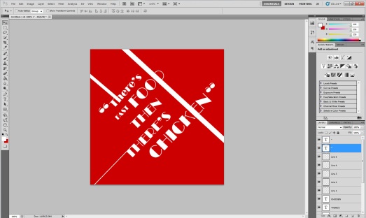
After researching on the different ways and techniques type is used to convey a message, I began to try out a few of these elements on my own idea to see what I could create. I experimented on the ‘KFC’ square first.

With this experiment I didn’t focus on how the text could portray the quote. I merely focused on the layout and how I could make it appealing to the eye. I am not entirely pleased with this design as there is not much indication as to where it could originate from. I chose the colours red and white to portray the ‘KFC’ logo colours, however it is quite difficult to recognise this.
For my next experiment I will probably focus more on how I can relate the quote with the company it comes from and portray this in a creative way.
With this next idea I used the same font used in the ‘KFC’ logo to create my text. Immediately the audience can gain a familiarity with this, however design and creativety wise the whole piece is very bland. Continuing this idea and developing it a little further could improve this a lot more.
I further developed my idea my adding a similar element that the original ‘KFC’ logo has and incorporated it into my own design. This worked well in some cases and didn’t in others. This typographic image works as a whole because the typeface and shape can be related with the ‘KFC’ logo. On the other hand the design as a whole doesn’t look interesting and again doesn’t attract the audiences’ eye. This area needs to be worked on and again developed. I will try focusing on elements such as positioning and colour to see the results I get from that.
Looking at the erros in my previous experiment, I corrected them and as well as adding a few other elements that I felt could improve the piece as a whole.
There are many similar elements that will enable my idea to be recognised with the ‘KFC’ logo. At the moment I am pleased with the first square idea and will continue to use this technique for the other squares.